Cornering: A Display Font That Cuts Through the Feed
It’s 9:47 a.m. on launch day—and I’m squinting at my phone screen, refreshing Instagram previews for the third time. The new seasonal promo series needs to land instantly: bold, breezy, unmistakably *ours*. But the headline font in the thumbnail feels… safe. Too neutral. It blends instead of bites. That’s when I open my fonts folder, scroll past the usual suspects, and click Cornering.
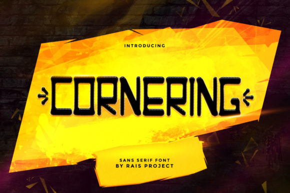
Cornering isn’t just another display font—it’s got that rare balance: contemporary without chasing trends, playful without sacrificing polish, distinctive without demanding attention *away* from the message. Its letterforms have subtle angular confidence—tight curves, clean terminals, just enough personality in the uppercase “C” and “R” to feel intentional, not gimmicky. It’s friendly but focused. Trendy, yes—but rooted, not fleeting.
We used Cornering across six core campaign assets this week: Instagram carousel headers, Pinterest pin titles, YouTube thumbnail text overlays, email banner hero lines, a limited-run digital ad set (1200×628), and the main landing page headline above the fold. In every case, it served one clear purpose: make the *first five words* impossible to scroll past.
Here’s what works—and why:
- Short, high-impact text only. Cornering shines in headlines under 6 words—“Summer Drops Early,” “You’re Invited,” “New Class Starts June”—not body copy or captions. Its rhythm is built for pause, not paragraph.
- Thumbnail clarity—even at 120px tall. On YouTube or Pinterest, where thumbnails shrink fast, Cornering’s generous x-height and open counters keep letters legible on mobile. No squinting. No misreading “Sale” as “Sate.”
- Strong contrast pairing. We paired it consistently with Inter (a neutral, highly readable sans serif) for subheads and body text. Cornering sets the tone; Inter delivers the details. For a warmer variant, try it over a light serif like Lora—just keep the serif light and spaced generously.
- Background flexibility. It holds up beautifully on both light and dark backgrounds—but avoid mid-tone grays or busy textures underneath. With Cornering, simplicity in the background amplifies its presence, not competes with it.
Real moment: I tested three versions of our webinar banner—one with Cornering, one with a rounded script, one with a heavy condensed sans. Colleagues glanced at each for under two seconds. Only the Cornering version sparked immediate verbal reactions: “That’s the one,” “Feels urgent but not pushy,” “I know what this is about before I read the rest.” That’s the power of visual hierarchy done right—not louder, but *clearer*.
It also plays well in motion. In Reels covers and animated email headers, Cornering’s clean geometry translates smoothly into subtle scale or fade animations—no wobble, no distortion. And because it includes OpenType features like stylistic alternates and standard ligatures (like the elegant “fi” and “fl”), we swapped in cleaner connections where spacing felt tight—especially over image overlays.
For creators building reusable templates—think Canva brand kits, Notion content calendars, or Figma design systems—Cornering slots in cleanly as the “hero typeface.” It doesn’t require custom kerning on every use, and its single weight (Bold) is intentional: this isn’t a font for fine-tuning hierarchy *within* a headline—it’s for owning the top line, full stop.
Before locking it in for client work or digital products, we always check three things: First, the license—Cornering is a commercial font, so yes, it’s cleared for ads, merch, SaaS dashboards, and client deliverables (no “personal use only” surprises). Second, file formats—we grabbed the OTF and WOFF2 versions for web and desktop use. Third, language support: it covers Latin-based languages thoroughly (English, Spanish, French, Portuguese, German, etc.), which covered our current audience scope. No extended Cyrillic or Arabic, so we’d pivot if launching in those markets.
We didn’t use Cornering for logo lockups—that’s not its lane—but it *did* become the de facto “campaign label” across all touchpoints: the small “NEW” badge on product cards, the “FREE GUIDE” tag in email footers, even the hand-lettered-style “FAQ” header in our help center. Consistency like that doesn’t shout “branding”—it quietly builds recognition.
And here’s something practical we learned mid-week: on dark-mode devices, Cornering’s contrast stays crisp *only* if you use true black (#000000) or near-black (#121212), not medium grays. One quick hex swap in our CSS variables saved a dozen thumbnail revisions.
It’s not magic. It won’t fix weak copy or unclear offers. But when your goal is to help people grasp intent before they finish scrolling—when your headline has half a second to earn attention in a feed full of motion, color, and noise—Cornering gives you that extra half-second back. It’s the difference between “maybe later” and “wait—what was that?”
So next time you’re prepping a launch graphic, tweaking a thumbnail grid, or building a set of branded social posts—don’t default to what’s familiar. Ask: does this font make the message *easier to understand*, not just prettier to look at? If the answer isn’t a quick yes, open your fonts folder. Click Cornering. And start again—with clarity first.